
The credible destination for gamers.
After Currys’ rebrand, the gaming identity needed realignment. Rather than creating a sub-brand, we extended the core Bright World brand to reposition Currys as a top gaming destination. I developed a direction that balanced brand consistency with gaming appeal. I created a unique flexible hero asset called the Halo, with a neon glow (inspired by lighting from gaming tech) that resonates with gamers which also functions to unify content, highlight products, and contrast in the new darker brand colour palette.

Insight: The landscape of gaming brands compared to Currys BAU Brightworld look and feel (shown in Magenta Square). The Currys Bright World look and feel is designed to appeal to the everyday customer, but we’ve identified a loss of engagement among our gaming audience.

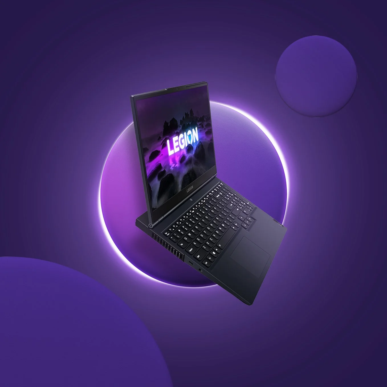
Floating

Grounded
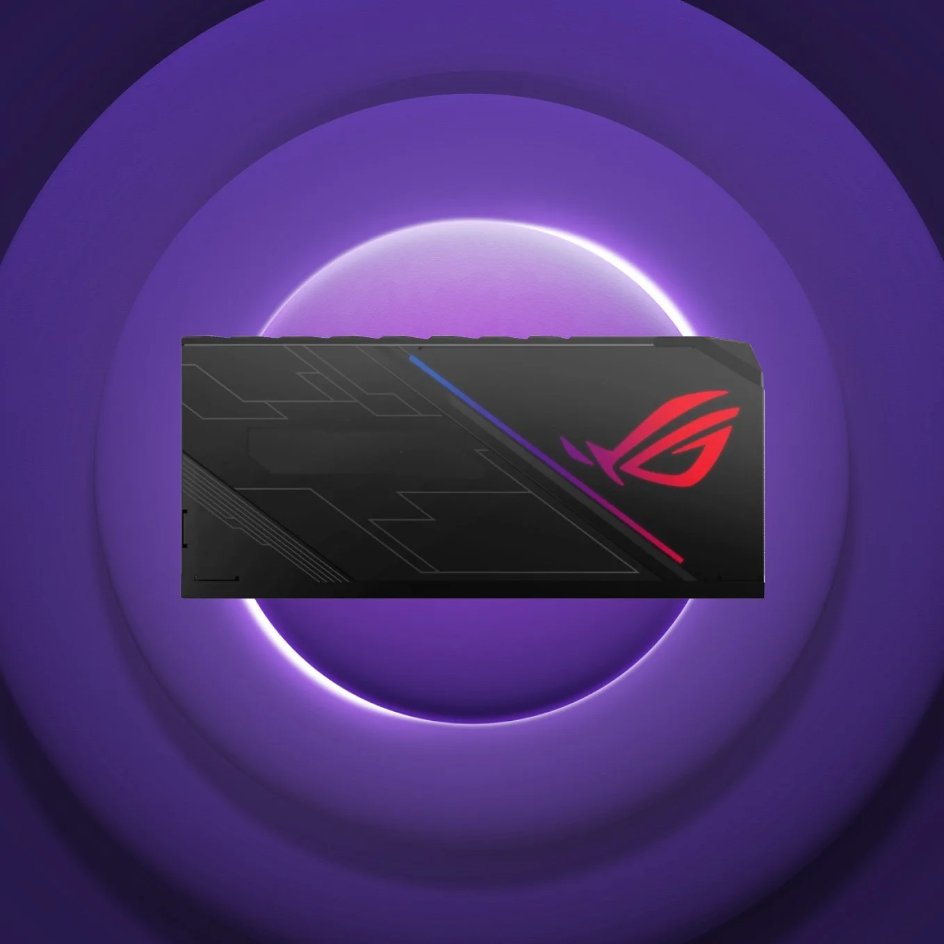
Pan / Top View


